Reducing Image Load Online

A big part of understanding any multimedia codec technology is knowing the application for such technology. For images, a big use case is web delivery. Compared to other multimedia, images are incredibly popular on the Web & knowing how to serve them properly can be a massive boon to your website's traffic as well as less of a headache for users on slower connections or who are under bandwidth constraints. The most disappointing part is that images are often poorly done on the web; all too frequently will you run into a site serving massive photographic PNGs for no reason, or photography sites serving photographs fresh out of the editing software with no thought put into their final delivery. A little effort, patience, & knowledge will go a long way toward improving the user experience for individuals using your site, & this article will illustrate some of the basics.
These instructions are for photographic images; other kinds of images, like non-photographic, artwork, pixel art, etc. should likely be handled differently.
Many images won't load properly unless your browser supports JXL, AVIF, & proper ICCv2 color management. This is for demonstration purposes only & shouldn't represent an actual common website experience. If you're curious anyway, the following browsers can display the contents of this page perfectly:
Fire & Forget
First, we'll illustrate what not to do, which is fortunately not incredibly difficult to avoid. Taking an image straight out of your editing software at a massive size will often bloat the size & resolution to something that isn't generally usable for a website regardless of the codec you're using & its quality per bit. It can be argued there are specific use cases that demand incredible resolution & fidelity coexist on the Web, but we won't be covering those here. Here's an example of a bloated image:
exported straight from Darktable at JPEG q90, with no scaling
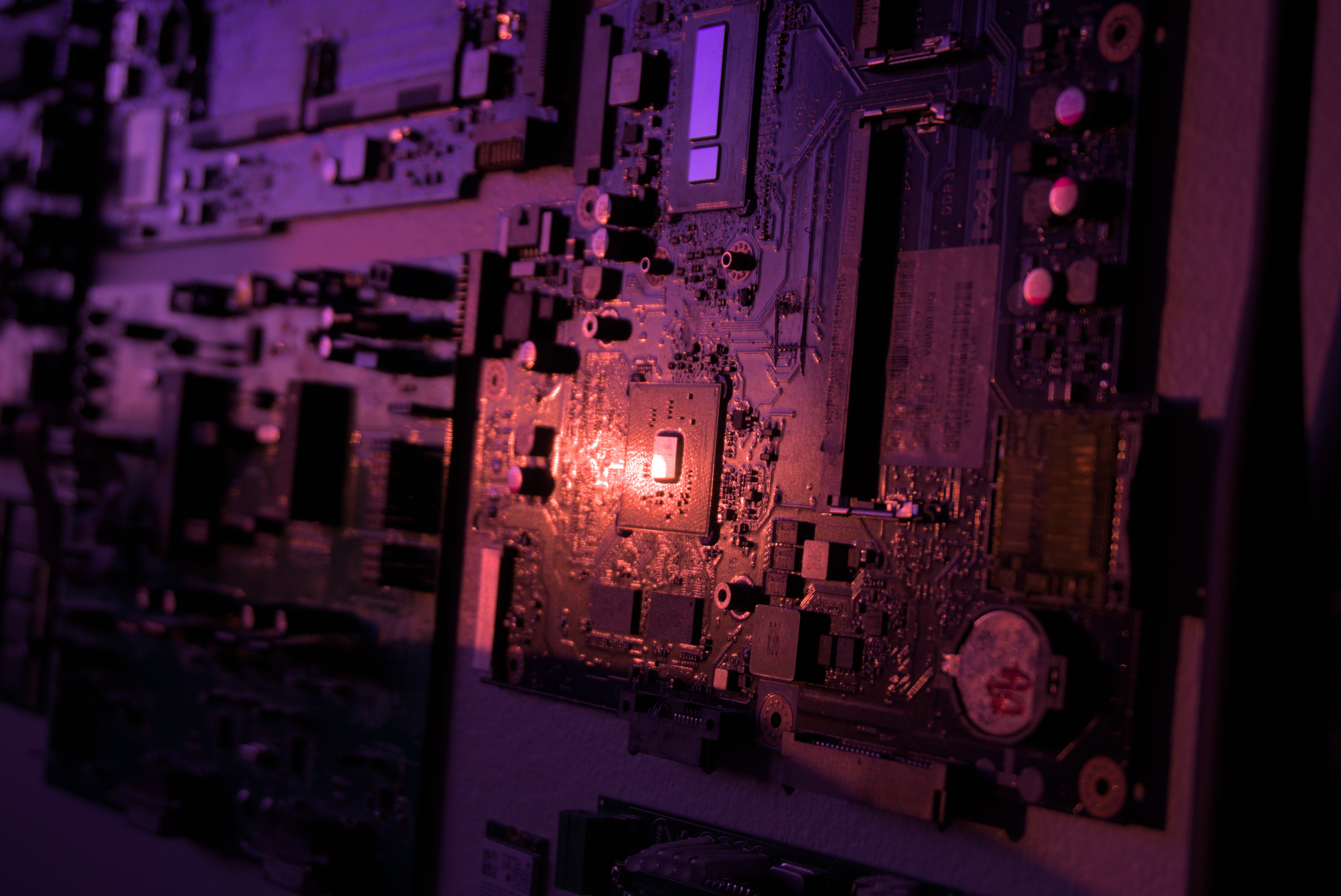
2.2 MB
Massive Improvement
The easiest way to have a large improvement without doing much work is to simply resize the image before serving it. Even if you exported a lossy JPEG, resizing should remove a lot of artifacts. The way to perceive a worst-case for an image's size on a site is to inspect the image element's width & height, which should give us an estimate of how large we should make our image. Any larger than this value is unreasonable since we're overfilling the element's size for no reason & the image is being scaled down anyway.
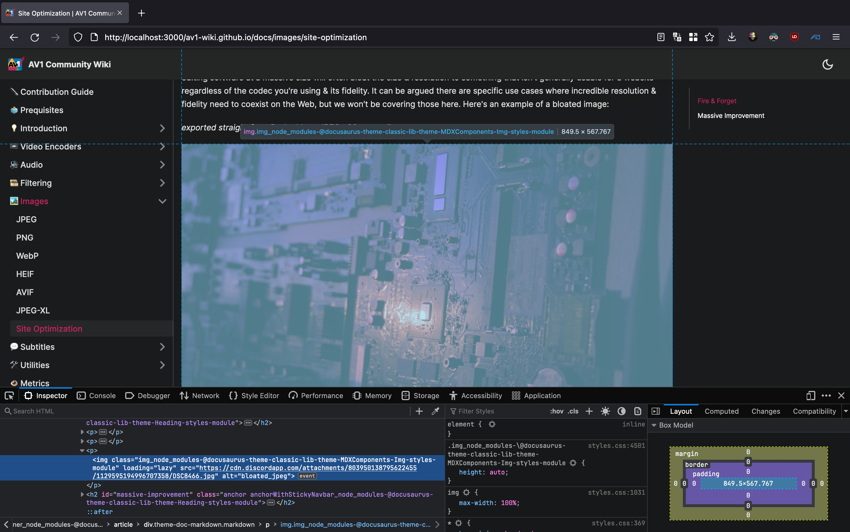 Inspect Element in Firefox. The Mac used to take this screenshot has a relatively high display resolution of 2560x1664. Because Macs scale things differently, we're probably going to want to double the horizontal resolution here.
The width is the most important value here, so our new image is going to be exported with a width of 1699 pixels. This new image, encoded at JPEG q90 with cjpegli, looks like this:
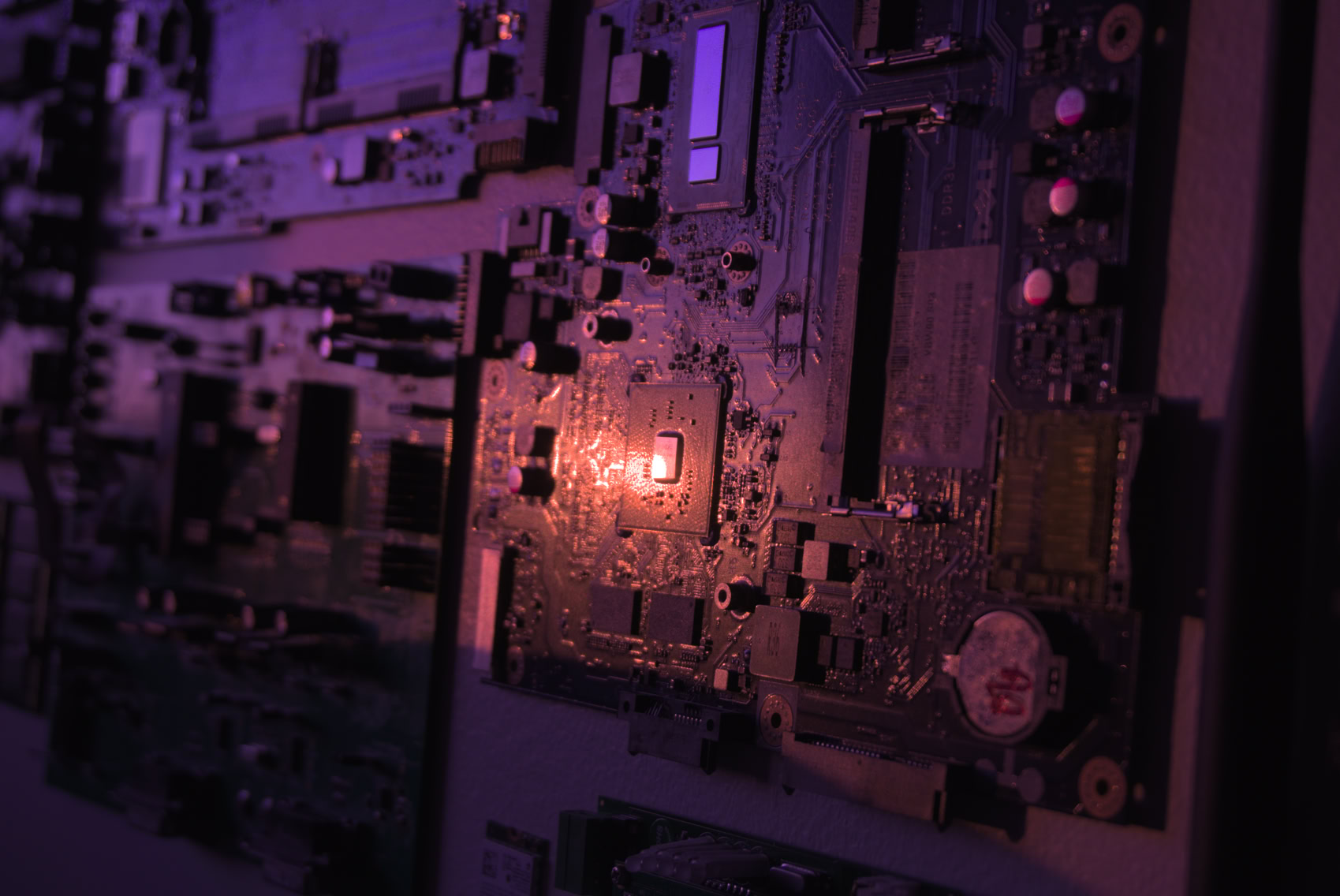
Obviously, there's lost fidelity compared to the original, but considering this is so much smaller, it is worth the trade-off for many. It is also worth noting we are using an improved jpeg encoder in the form of cjpegli, although that is secondary to the resize. If it doesn't look as good as you want it to, you can always scale the resolution up a bit, though currently, it looks plenty passable for its size.
2.2 MB -> 233 kB
Lazy Loading
A bonus tip is to add the loading="lazy" attribute to your picture tag to allow the image to load only when scrolled to by a user. This doesn't save bandwidth, but it improves the user experience by loading images further down the page only when necessary. An example may look like this:
<picture>
    <img src="/images/jpeg_fallback.jpg" alt="alt text" width="XX" height="YY" loading="lazy" />
</picture>
New Codecs
If you desire further improvement, it may be time to consider using a newer codec like AVIF or JPEG-XL. These options will compress far more effectively than JPEG, with the only trade-off being browser support. We're not going to consider WebP or HEIC, since WebP is not competitive enough with JPEG for photographic imagery (often being worse) & HEIC has been superseded by AVIF - which sees greater support anyhow - & is not royalty free, effectively preventing widespread Web adoption forever. Again, we're just considering lossy compression for photographic images; it is a different story with WebP elsewhere, as it performs well on non-photographic content & is almost always better than PNG for 8-bit lossless compression. So, we are left with JXL & AVIF for now.
Fallbacks
AVIF sees widespread support, but JPEG-XL isn't quite there yet with Web support as Google continues to push AVIF (it is debatable if it ever will be outside the Apple ecosystem). Even with AVIF, adoption isn't remotely close to JPEG, so it is worth providing a fallback. This can look like the following example:
<picture>
    <source srcset="/img/jxl_image.jxl" type="image/jxl" />
    <source srcset="/img/avif_image.avif" type="image/avif" />
    <source srcset="/img/webp_fback.webp" type="image/webp" />
    <img src="/images/jpeg_fallback.jpg" alt="alt text" width="XX" height="YY" loading="lazy" />
</picture>
Here is a JXL falling back to an AVIF falling back to a WebP falling back to a JPEG. Pretty intense to have this many fallbacks unless you're really after the ultimate compression ratio, but it is certainly an option. AVIF & JPEG alone will probably be enough for most.
Compression Efficacy
Let's look at how our image examples compare to the original with our new codec selection. We'll be aiming for high visual fidelity, so around the same quality as our initial JPEG encoded with cjpegli (which scores ~83.01 with the SSIMULACRA2 visual fidelity metric).

137.0 kB JPEG-XL image, encoded with cjxl lossless.png out.jxl -d 1.49 -e 9. Score: ~83.04 3.06s user time

124.8 kB AVIF image, encoded with avifenc -c aom -s 4 -j 8 -d 10 -y 444 --min 1 --max 63 -a end-usage=q -a cq-level=16 -a tune=ssim lossless.png out.avif. Score: ~83.03 7.54s user time
JXL also supports lossless transcoding of JPEG images. This means every pixel is identical, the image just has a smaller filesize than the original JPEG; if you can use JXL, you can transcode existing JPEGs losslessly on your site & save some bandwidth that way. The JPEG transcode below gives a higher SSIMULACRA2 score than the original for some reason, but I'll chalk that up to a decoding inconsistency between how the ssimulacra2 program decodes JPEG & JXL. Either way, the scores are fairly close.

189.4 kB JPEG-XL image from JPEG, encoded with cjxl input.jpg input-recomp.jxl -d 0.0 -e 9 --brotli_effort=11. Score: ~84.92 (???) 0.67s user time
The final trick we can use, while not a new codec at all, still increases quality per bit. Encoding an XYB JPEG with cjpegli encodes with the perceptual XYB colorspace using an ICC profile to modify the original JPEG colors, avoiding JPEG's normal YCbCr which isn't perceptually optimized for the human visual system. Using XYB, we can afford identical quality with less bitrate than normal JPEG. This has universal compatibility, but not every application understands how to handle the XYB color profile (although color-managed modern browsers should be fine).
208.3 kB XYB JPEG, encoded with cjpegli lossless.png out.jpg --xyb -d 1.155. Score: ~83.04 0.10s user time
In this particular instance, AVIF seems to be the overall winner. This isn't always the case due to JXL's superiority at higher fidelity & with more detailed images, but according to SSIMULACRA2, AVIF has the best quality per bit with this image. You can use your own eyes to further clarify your choice, though. It is worth mentioning that as these were encoded from a 16-bit source PNG, the JXL image is the only one that maintains the full original bit depth, & AVIF isn't fast to encode.
Responsive Images
Displaying an image that is too large for a viewport is a waste of bandwidth, & displaying an image that's too small for the viewport leaves fidelity to be desired. Luckily, we have the Responsive Image Linter that can help us figure out which image sizes we should be using.
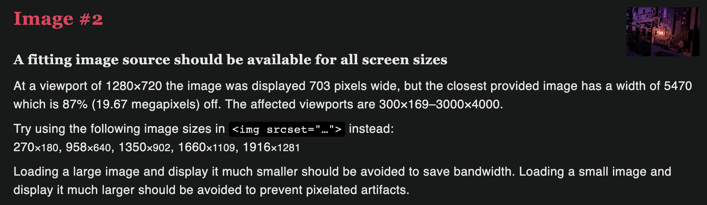
In our fire & forget example, we see that we are serving an image that is far too large. We already know that, but now we can see that given various viewport sizes we could be serving images that have respective widths of 270px, 958px, 1350px, 1660px, & 1916px to optimize for delivery to a variety of different devices. Here's how we'd write that in HTML:
<picture>
  <source type="image/jxl" srcset="/img_270.jxl 270w, /img_958.jxl 958w, /img_1350.jxl 1350w, /img_1660.jxl 1660w, /img_1916.jxl 1916w" sizes="(min-width: 2000px) 1916px, (min-width: 1700px) 1660px, (min-width: 1400px) 1350px, (min-width: 1000px) 958px, calc(100vw - 24px)" />
  <source type="image/avif" srcset="/img_270.avif 270w, /img_958.avif 958w, /img_1350.avif 1350w, /img_1660.avif 1660w, /img_1916.avif 1916w" sizes="(min-width: 2000px) 1916px, (min-width: 1700px) 1660px, (min-width: 1400px) 1350px, (min-width: 1000px) 958px, calc(100vw - 24px)" />
  <img width="1699" height="1136" alt="alt text" srcset="/img_270.jpg 270w, /img_958.jpg 958w, /img_1350.jpg 1350w, /img_1660.jpg 1660w, /img_1916.jpg 1916w" sizes="(min-width: 2000px) 1916px, (min-width: 1700px) 1660px, (min-width: 1400px) 1350px, (min-width: 1000px) 958px, calc(100vw - 24px)" src="/fallback.jpg" />
</picture>
It is worth noting that this example above & the example below aren't perfect implementations of a responsive image given the conditions of this site, but the general concept still applies. Some things to note:
srcset= the images available to your browser to serve, & their respective widthssizes= the conditions given to the browser explaining under what conditions should it serve which image(min-width: XXXpx) YYYpx= Given the viewport is at least XXX wide, serve an image of YYY horizontal resolution. The browser will pick an image from srcset that is CSS pixels * display scaling.calc(100vw - 24px)= Usually preceded by a (min-width) condition. Specifies a value the browser should calculate on its own to pick the closest option from the srcset. Let's say we have(min-width: 997px) calc(75vw - 257px). This means given the viewport is at least 997px wide, calculate 0.75 * the current viewport resolution - 257 to find the closest image in the srcset to fit the number of pixel specified.

That's all! Massive thanks to Auto-Rez Media Technologies for the inspiration behind this article & explicit permission to use their Reduce Your Page's Image Load blog post when writing this entry. I have confirmed with their leadership that this wiki entry can be safely licensed under CC BY-SA 4.0.